Using different colour surfaces for pastel work
I often get asked, ‘what colour surface should I use? If I make the wrong choice, will it ruin my painting?’
The answer is, of course, complicated! Sometimes it can make your life a lot easier to use a certain colour or tone, but sometimes it really doesn’t matter. And there is never a right or a wrong – you just get different paintings.
As I am preparing for my zoom workshop ‘The Colours of Summer’ next week, I think this is a great time to look at the question. This piece is all about celebrating colour, so what better time is there!
I often pick muted grey backgrounds for my zoom workshops, mainly because I know it’s a colour of surface that is easy to find wherever you are in the World. With the ‘Horse’s Head’ workshop last month, it really helped us to work on a brown surface.
However, with ‘The Colours of Summer’ the piece could really work easily on any colour.
So this is a great opportunity to experiment with choosing a surface colour, to learn what we will like to use.
There are a few things to bear in mind as you make your choice…
- With pastels, the colour of your surface is part of your palette.
- Our use of colour will create a mood and an energy, so are you feeling calm and peaceful, or full of bright energy?
- How do you want the person viewing your artwork to feel? Do you want to lift their spirits? Or make them feel relaxed and peaceful? Or a mixture of both?
- Colour has power, and the more we experiment with using it, the more we can convey the energy that we want to, in our work.
NB I should say at this point that we are dependent here on how my camera has seen the colours I have used, and then how they are showing up on your screen. However, even allowing for these variables, I think we will see and understand the differences.
Changing colours
The main thing to know is that the colours of your palette will behave differently on a surface, depending on changes in;
- How light or dark the surface is
- How bright or subtle it is
- Which colour it is (Warm or cool? Red, yellow, blue or brown?)
Of course, there are many complexities and variables in this, but let’s try to simplify it a bit….
Test your colours
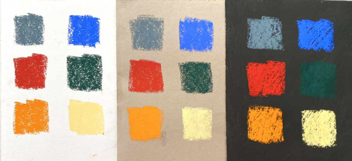
To start with, let’s take 6 colours and place swatches of each on different tones and colours of surface….
Lights and darks
First of all, a light (white), medium (pale grey) and dark (black) surface.
Just look at how different they appear to be!
We can see that a colour that looks mid-tone on a mid-tone surface will look darker on a light surface and lighter on a dark surface
Now let’s put the same 6 colours on a range of paper colours…

Different colours of paper
All looking different again, but in less obvious ways.
They are not just affected by how light or dark the paper is, but by other variables and complexities that colour brings with it, such as….
- How close to the pastel colour the paper is
- How saturated the colour of the paper is
- How neutral or muted the colour of the paper is
- How warm or cool the colour of the paper is
When you place a pastel colour on a bright and then on a muted colour, it feels like the pastel colour changes personality. Just look at the blue/grey on the top left corner of each piece of paper. On the bright blue it looks pale, subtle and grey, but on the orange it is strong and more blue. On the paler grey it looks darker and stronger.
The bright red ‘pops’ off the strong blue, but almost disappears on the pinky red paper.

For ‘The Colours of Summer’ workshop piece, I have decided to use a neutral grey (Colourfix pastel primer, colour ‘elephant’) as I want each pastel colour to behave as I expect it to, as I take it out of the box.
I don’t want any unexpected changes!
I have based this decision on some experiments I made earlier….
I found that this piece would also work on a variety of colours of surfaces, and there really is no right or wrong here, just personal preference, or what you have to hand.
I did some extremely quick colour sketches, (so please judge the quality of my drawing too harshly!) using exactly the same choice of pastel colours as for the original piece, and found that the colours behaved differently in each case…

The colour swatches on the right of each piece show the order I used them in, from top to bottom. Amongst many observations, one that jumps out is that the orange pastel colours really pop off the ultramarine blue paper. I don’t really care which sketch looks ‘best’, but by doing these tests, I got a feel for which surface colours I preferred, and which ones I wasn’t too keen on for this piece of artwork.
And it’s really important to be happy as you paint, so experimenting to find these answers is time well spent!
I definitely found that a bright blue will die back on a blue surface but will pop off an orange one. This relationship between complementary colours is something that we will be looking at particularly in the workshop ‘The Colours of Summer, where we will use them to create the heat and dazzle of a hot summers day.
If you really want to get to know the colours of your own pastels, its a great exercise to do the same piece on different surface colours.
Emotion
With all of our work, whatever the subject matter, each individual colour will have an emotional impact on the artist who uses it, but also on each viewer looking at it. I don’t have the time or space to look at that in detail here, but as a generalization, I find that using bright colours can create a sense of joy and energy in my work, whereas muted colours can create a sense of calm.
I like to use subtle surfaces and backgrounds for a lot of my animal and equestrian work. This can make life easier, as the hues are usually in the coat of the animal subject.
However, I use brighter backgrounds if I want to have some fun, and create a piece that reflects that.
But, I have to be careful that I don’t do too much smudging, as if I want the piece to celebrate the brighter colour, I don’t then want to smudge it into oblivion! It helps to approach this work with some confidence, and to keep standing back to see the ‘bigger picture’.
The work of the Impressionists is incredibly inspiring and interesting. You can stand very close to one of Monet’s waterlily paintings, and all you will see are a lot of small flicks of colour. But stand back a few metres, and the colours all blend and make sense.

Lets look at some other examples of similar pastel pieces on different colours of surface
This little Moorland sketch is on pale grey/blue Colourfix primer. I love the clean fresh blues that you get in the distance here in Devon so used that as my base, to create a light and airy feeling.

This little Moorland sketch is on red acrylic, with clear Colourfix primer to give the surface some tooth.
It was really fun to paint this one, as having a red base made the greens pop off, and leaving flecks of red showing through in the foreground created drama. However, in the distance I smudged the pastels, so not much red shows through at all.

Lurcher on a muted brown/pink.
The brown is left to show through the coat, but the overall effect is subtle and gentle

Lurcher on ultramarine blue.
I have left some of the blue showing in the shadow area of the coat, but the overall effect is much more vibrant than the previous one

‘A Hard Race’, with a surface of Colourfix primers, mixing a few colours together.
By using muted and very subtle surface colours, I could focus more on tone.
I also used richer, more saturated browns on the horse so that it stood out against the muted slightly bluer background colours. The changes of colour in this piece are VERY subtle!

‘Swish and Flick’, using a bright red surface painted with acrylic, and then a layer of clear Colourfix primer to give the surface some tooth.
I chose this red to help emphasize the sunlight coming through the creamy colour of the mane and tail and I wanted those creamy/whites to pop and create a sense of joy.
I tried to leave the red showing through under the coat as much as possible, and used soft lilac greys to create shadows on the horse.
I really wanted to have fun with the creams and greys against that bright red, and I did!

‘Lost in Thought’ using Colourfic parimer with a mix of colours to make a brown which served more than one purpose.
This was a perfect colour for under the sand and rocks, and also for the skin tones, but was almost complementary to the bright blue sky, so I used it get more pop to that sky, and also the very light t-shirt.
So the warmth and the darker tone of the surface colour were a great help when I painted the piece.
We’re all different
Different artists work in different ways. There is no right or wrong with art!
Time well spent
It is only by trying things out and experimenting that you will find what works for you. It will be time we’ll spent. This is a great activity for those days when you have ‘lost your mojo’, when you don’t know what to draw or paint, and just don’t feel very inspired.
Going a journey of discovery without any expectations can lead us on new adventures, and we will make new discoveries. It always inspires me to find out something new!
So give it a go!
Try some landscapes, seascapes, animals, or whatever subject atter you prefer,but try some new surface colours and see what happens.
If you have got this far, then thank you for reading and Happy Pastelling!
If you want to join the zoom workshop ‘The Colours of Summer’ on Monday 4th March you can book a place here. There will be a recording available afterwards for those who have registered for the event.
You can find out more about zoom courses and online workshops here
You can see the pastel sets that I use here